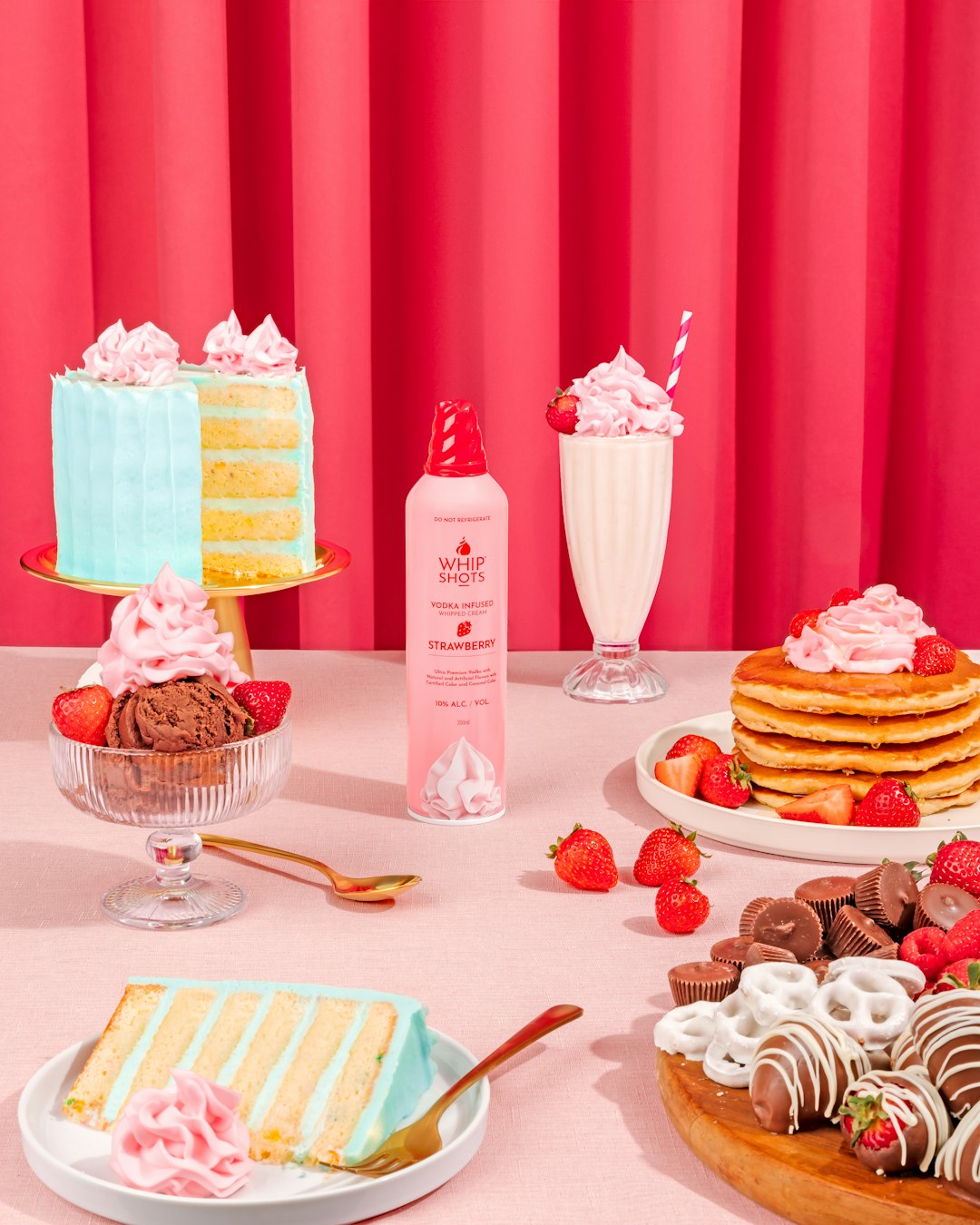
Section Configurations allow users build content grids by adding a section to display a row. Within each row, users can add content blocks, configure how many show per desktop and mobile and adjust spacing. Below are a few examples but this section is meant to be flexible
Images can be either "small" or "large" (or edited at a theme/brand specific level)
More to Love
More to Love
User can add 0 to 5 content tiles per row, and specify how many show per desktop and mobile view
This example below is set to 5 on desktop, 2 on mobile
More to Love
User can combine rows and adjust top, side and middle padding to create grids
More to Love
User can choose to have text on content tiles, and choose to overlay with horizontal / vertical alignment configurations OR show text beneath
More to Love
More to Love
More to Love
User can update color of background and copy within tiles and


